
Sunday, December 26, 2010
Change... a peek...
I have been excited about this challenge since it was announced. Here is a peek..... hey... a 'change' is underway... hmmmm

Friday, December 3, 2010
ICON: RADIOACTIVE HANDS
 This is not a very good picture. I will have to have it photographed professionally. There's some silk embroidery on the hands, and beads. After I had put it together, I did think the hands looked radioactive, given the colors I chose -- another thing with iconic meaning.
I came up with hands after stewing for a long time over the meaning of Icon. There are so many things one could do with that theme. I finally thought of hands because there are so many meanings with hands -- and we are artists and work with our hands. Some of the things from the Thesaurus that jumped out at me: applause, come to hand, give a hand, helping hand, hand and glove, hold hands, on the other hand, under hand and seal, with one hand tied behind your back, hand down, hand up, hands on, hand out, hand over, handbag, handcuffs, handicap, hand in hand, handiwork, handmade. And maybe that's enough.
Susanne
Wednesday, December 1, 2010
Next Word: Change
Those who know me well, know that my motto is:
Everything changes
Nothing stays the same
Make your peace with that
and all will be well.
I hope you all enjoy change as much as I do!
From the Houghton Mifflin Online Dictionary:
Noun
1. The act, process or result of altering or modifying: a change in facial expressions
2. The replacing of one thing for another; substitution
3. A transformation or transistion from one state to another; a change of seasons
4. Something different; variety; I ate early for a change
5. A different or fresh set of clothing
6. Money of a smaller denomination given in exchange for money of a larger denomination
7. The balance of money returned when more than due is given
8. Coin
9. In music; a patter or order in which bells are rung
10. In Jazz; a change of harmony, modulation
11. A market or exchange where business is transacted.
Lisa Kay
Icon - Worship from Afar
In an online discussion about the word Icon with our group, Susan Hendrickson said "What I am thinking of here is to move from the literal (a picture of an icon) to the personal." That statement got me thinking about not looking at the icon, but at the person "making" the icon. What I mean by that is that for something or someone to become an icon, someone has to worship it or them. How do they worship? In the case of a moviestar, singer, etc., the worshiper rarely, if ever has contact. That makes the only worship available to the worshiper "from afar."
The back ground walls are hand dyed cotton fabric, commercial cotton floor. I wanted the look of graffiti on the walls without it being words and I think that I accomplished it. The words Worship From Afar were first quilted but didn't show up enough so I also highlighted the words with fabric markers. The open doorway is also hand dyed cotton and acrylic paint outline and stamped word Icon. I didn't use an "O" but found a circle stamp in the right size.
The hands belong to a friend of mine. I took a picture, digitally altered it into black and white and printed it onto cotton fabric, and simply hand stitched around it with wool embroidery thread left over from a project from 28 years ago! I then "tacked" the hands onto the front down the middle (but not going through the hands) so that they stand out from the background. The piece is faced with the same hand dyed scrap as the walls.
It has been a busy day and I almost forgot to post! I had to get up after going to bed because all of a sudden I remembered!
Lisa Kay
An Icon of Prehistoric Art

I knew immediately what my image of an icon would be!
I took an art class this fall, and one of the things that just fascinated me was the story of the oldest known carving, called the Venus of Willendorf. She is a tiny (4.5") statue unearthed in an archeologic dig in Austria, in the town of Willendorf. She was created about 22,000 BCE, in an age when we were hunter-gatherers and Europe was essentially in an ice age. She is carved of non-native limestone (what does that tell us?) and tinted ochre red.
What is she? She has large breasts and hips and striking detail of the labia of the vulva. Her arms are small, shown resting on her breasts. She has no feet, and cannot stand erect. She has no face. Or is it covered by a woven cap? Or is that braided hair? Or is it the face that mustn't be seen?
What was it like for a woman in the cold climates, thousands of years ago, hunting and foraging for food. Imagine being pregnant, giving birth. How many women, how many babies survived the cold? Did the mothers have enough milk to keep the babies alive? In such devastating times, a woman built like the Venus -- wide-hipped, well-stocked breasts, and extra fat -- would be well provided to be a survivor and provider for her babies.
Is she an "earth mother"? A goddess? A fertility symbol? A work of Art? Or is she merely Paleolithic Pornography? They say that her most satisfactory and satisfying position is to be held in the hand: she becomes a remarkably sensuous object. For women? For men? For children?
These figures have been found from western France to the far reaches of Siberia. Isn't she fascinating?
Construction: I made the background first, hoping to suggest layers unearthed by the archeologists. The venus figure is made of two layers of red charmuse held together with misti-fuse. Her details are done with thread-painting; I hope they show up clearly enough. Then I printed some tidbits of information on Jaquard organza, and stitched them here and there on the front. The back tells the story of the Venus, printed on sticky-backed Pabric.
It's fun to google "the Venus of Willendorf."

"Simply An Icon" by Jan Girod-Icon
 Have you ever fought within yourself over doing what first pops into your head, in a test it is called "second guessing" I used to do it all the time. The moment the new word was "unveiled" 2 months ago I pictured doing this piece, at least in some fashion. However, I spent the entire time trying to talk myself into doing another piece when all was said and done I found myself back at the first thought, the first image that had come to me.
Several years ago I had the opportunity to tour the Hermitage in St. Petersburg, Russia. When we found ourselves in the space with the Russian Icons, I was stopped in my tracks. Have you ever felt like your moving in slow motion? There I was standing in one spot, turning slowly, wondering how I was going to look at them all. They were exquisite! Some extremely ornate, some expertly painted, others were very primitive; but all were very beautiful. I could have stayed there all day; however I heard someone rather loudly instructing me to move on, move on. All I could think ....was oh no....please let me stay here...I swear I will be on the bus in time. Poor guide was afraid she would loose her job, I moved on, but have always felt like I missed out. Someday, maybe someday I will return.

icon reveal - ani difranco
 Say It
Lynn Krawczyk
The word issued to us for this challenge was Icon. I had to give this one a little think. Its got a huge connotation to it, could go in so many different directions. I knew almost immediately that I wanted to do a person, a woman. An artist? A poet? A musician?
How about all three?
I chose Ani Difranco. She is a singer, song writer, activist, loud mouth, unabashed, tell-it-like-it-is, political woman. She says what she thinks and makes no apologies. I have been fascinated with her music for years now and often find myself playing her albums when I am in the studio, looking for the zone to sink into so I can get some serious work done.
She is the kind of brave that I hope to be someday.
You may not agree with her politics or what she has to say, but you have to admire that she stands up and says it without apology. She is an icon of the music industry.
I knew that I wanted to use a photo of Ani in the quilt but I didn't want it to be just plunked down and glaring. I wanted something that was scuffed up looking, rough around the edges - a prominent part of the composition but not bold all at the same time.
I found this photo on flickr and asked the photographer if I could make a thermofax screen out of it. I received a yes and was off and running.
I pulled brown fabric from the stash that was discharged in a folded pattern and some vibrant orange hand dyed cotton. Ani is not quiet with her lyrics and music and I didn't want to do a low volume piece.
I did three layers of thermofax screen printing. First up is a scuff print of the photo:

The second layer of printing was an all over text and then the third is an abstract coffee cup stain design.

I hand stitched the piece in a neon yellow perle cotton thread in bold graffiti like stitches.

I like the contrast, the push and pull of the colors against each other.
It was fun to explore a piece that expressed what I feel when I listen to Ani's music. I'm happy I got to honor her in this challenge.
Homage to Westwood and Balenciaga
 In this piece I pay homage to two fashion icons - Vivienne Westwood (British) and Cristobal Balenciaga (Spanish.) When I saw the Westwood exhibit at the de Young Museum here in San Francisco, I was blown away by her vision and courage. (So much so, that I returned twice.) I was first introduced to Balenciaga on a trip to Spain in 2006.
Unable to get into the Picasso Museum due to crowds, I opted for the Textile Museum just across the street - what a treat! On the top floor I discovered an exhibit of Balenciaga's work decade by decade. His couture pieces were stunning.
The faux fur/leather was purchased in Santiago de Compostela (on that same 2006 trip.) The fabric shop was jaw-dropping beautiful. The snakeskin jersey was purchased there as well and yes, I made the gloves (mostly by hand) from a Vogue pattern and have a new respect for glove makers! That same fabric is echoed in the Dior roses. An old belt was sacrificed for the sake of art and the feather trim is from a store in Fort Bragg. I have had it for years waiting for the perfect project.
For those who know these two designers, it may seem odd to put them together in the same piece. The gloves and fur are for the wild Westwood. The Dior roses and hand stitching are in honor of Balenciaga.
 It seems to me these two coexist quite nicely here. I had planned a series based on couture dressmaking techniques. Now that I have finished this piece, I find I want to go in a different direction with that series. Rather than reproduce techniques I rather like the idea of interpreting each in a more personal way. And I am quite sure there are more gloves in my future...
Susan in San Francisco
TOBLERONE

Do you know the Swiss chocolate Toblerone? It has the form of a trianlge. On the wrapping is one of our famous mountains, the Matterhorn.
My husband and me spend since 3 years in June or July a few days in Zermatt, at the foot of this unique mountain. We are every year impressed anew by the changes, that the sun and the light create on this huge triangle.
I printed one of my pictures onto fabric. In my stash, I had almost the same blue as the sky and some dark green for the trees. I bought two special fabrics for the left side (smile) and pieced it.
And the triangle at the bottom?
The preamble of the Swiss Federal Constitution of September 12,, 1848, starts with the words:
'In the name of Almighty God!'. I am glad, that this is the foundation of our beautiful country.
 |
| Toblerone and Matterhorn |
Saguaro
It was so hard to figure out the difference between 'Icon' and 'Logo'...as in the Nike 'check' and Marilyn Monroe.... especially to make something I wanted [as in having to live with whatever I make]. I could have used the Canadian Maple Leaf... but do I want that on my wall? Not really..... then , while going through some of the maps in the car, the Saguaro on the Arizona map caught my eye. And...so true... is the Saguaro not synonymous with the desert... particularly in Arizona? That is how I chose what I would do... and here it is....
 |
| Saguaro in bloom I started with a piece of hand-painted fabric... somehow it seemed to have the right color and texture for both the background and the foreground. Free motion stitching, some decorative stitch and hand stitching complete the 'feel'. The binding.. which this piece seemed to need was hand dyed commercial fabric using a tjapa from Indonesia. It had the prickly sense... so it worked. The flowers and the saguaro arm are painted and the 'prickles' are thread. Here is a close-up shot of the flowers.... which were made using a soft polyester and rusted cotton interfacing... [nothing is sacred!]  Carole |
Icon or Logo?
I thought about the Nike Swoosh. Surely it is symbolic of athletics worldwide...so has it become an icon? I think so!
I have been doing a series of quilts with my own little creature who I call a "Dunderhogan". This seemed to be the perfect time to revisit him in all his confusion. I picked logos that most people can identify quickly and created a question mark "logo" over his head to express his and my confusion over the word. I played with felted wool on upholstery fabric and opted not to quilt the piece. I discovered that I love working with felted wool and am now creating a larger quilt with it.
 Here is a close up of my Dunderhogan. He always has wide open eyes and a fuzz ball on his belly. You can see others at www.dunderhogan.blogspot.com. This one will join the gang soon.
 Here is a close up of my Dunderhogan. He always has wide open eyes and a fuzz ball on his belly. You can see others at www.dunderhogan.blogspot.com. This one will join the gang soon.
 This was a wonderful word to ponder. Looking forward to the next one.
Icon

Here it is. When I first started to do art quilts and play with abstractions, I used the blue shape you see coming out of the rectangle on top to depict my spirit. I have done this many times, not to be confused with the leaves I also use frequently. This image is a great comfort to me and fun to play with in compositions. When Icon was announced I knew I wanted to once again create a journey, my journey, the journey of all of us.
The piece is machine stitched, fused, tulle overlay(very frustrating to quilt over) and machine quilted.

This close up is of the bottom layers......the earth, where we are rooted, grounded.......

This close up is from higher up where I transitioned to lighter colors, showing how we break out of our boxes. This part of the quilt also has some of my hand dyed silks while most of the bottom is commercial fabric.
Thanks for a great challenge.
Tuesday, November 30, 2010
Peek a boo!

Here is my peek. I formed an idea and actually followed it through to completion.
Tomorrow is the day......and the background for my next piece is already on the sewing table.
Friday, November 26, 2010

Friday, October 1, 2010
Ebullient
 When we were given the word, I thought...what the heck? That is one word I never hear...or use... but amazingly I have heard people use it at least 4 different times in conversation since I read the definition. Synchronicity??? I pondered for a long time and the idea of water squirting from a fountain kept going through my mind. I used fabric paper again because I loved the deep colors and I wanted a cheery background hence the bright yellow dyed fabric. After a crazy summer I just needed to keep it simple.
And the word is...ICON
Icon , noun
2: [Late Greek eikōn, from Greek] : a conventional religious image typically painted on a small wooden panel and used in the devotions of Eastern Christians
5 a : a sign (as a word or graphic symbol) whose form suggests its meaning b : a graphic symbol on a computer display screen that usually suggests the type of object represented or the purpose of an available function
Have fun and I will see you all back here December 1st - enjoy!
Have fun and I will see you all back here December 1st - enjoy!
An Experiment
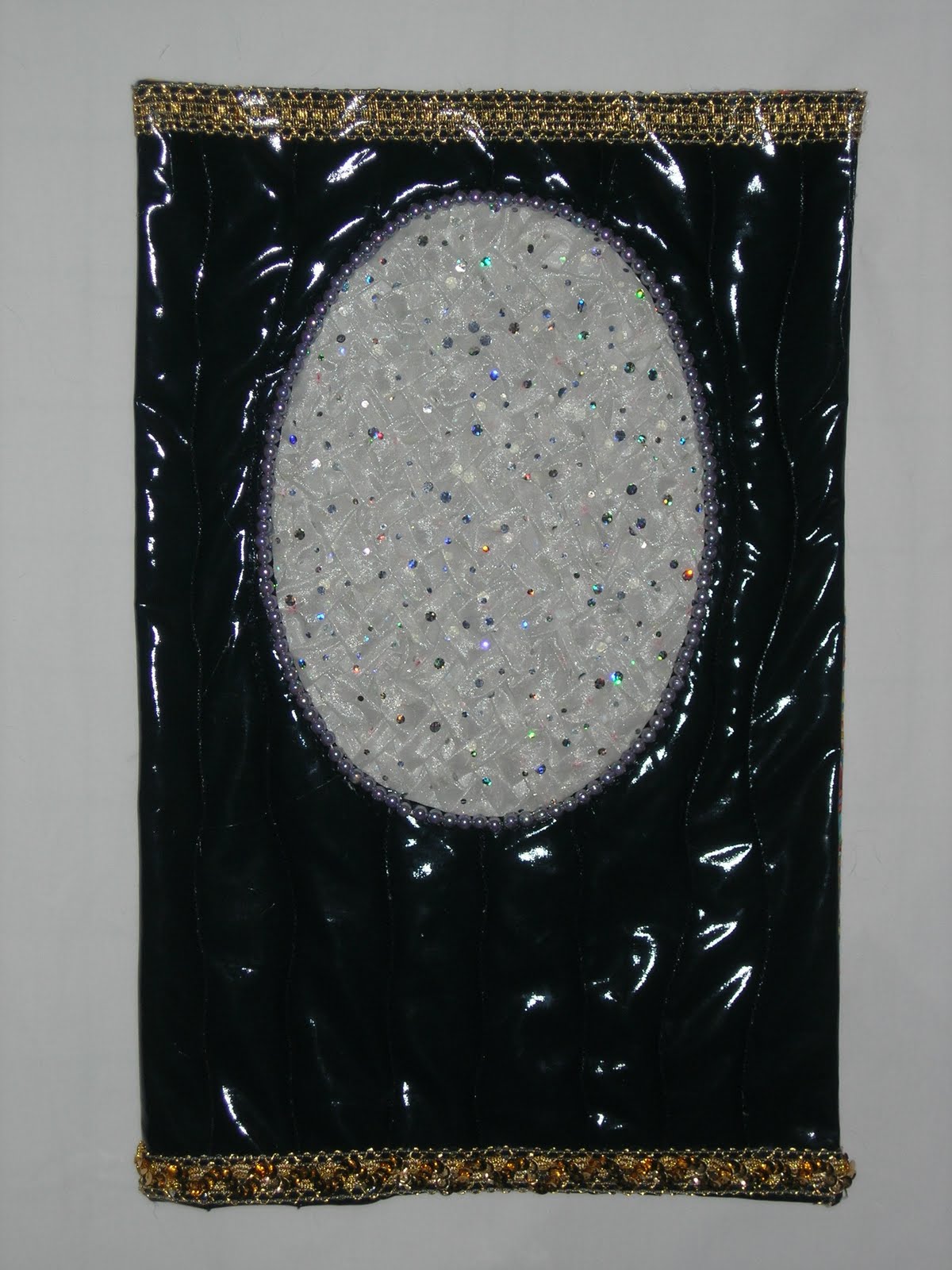
I thought long and hard about the Ebullient challenge. A few ideas started to form, but nothing really gelled. And then I received the November issue of Threads magazine with an article about smocking. The effect was wonderful - it looked like woven fabric tubes. I had some sequined
organza and set about smocking it. That particular fabric was something of a nightmare to use, but I pushed on. The design complete, I finished the smocking and promptly changed my mind about the border fabric, opting instead to use a shiny, navy vinyl with a peek-a-boo opening framed with beads. Working with the vinyl made the organza seem easy in comparison. And a word of advice here...shiny vinyl is hard to photograph.
You know how it feels to pass the point of no return with a project? When you have used up your little bag of tricks and hear Tim Gunn's voice in your ear "make it work!" But the more I worked the more I heard Heidi Klum say "it looks home sewn'" and then "I'm sorry, Susan, You're out."

And so, what I have is a door. A Star's Dressing Room Door. The lesson here? It's all well and good to try new materials in a challenge - that is the point! To try new things, stretch, grow as an artist. Some experiments work out well. Some not so much. Hence the title. An Experiment. And it was. And the best part was the smocking. I will use that again, but with a lovely light-weight wool or silk. Maybe this weekend...
Susan H. in summer-what-summer-I-don't-remember-summer San Francisco
Dancin'
In earlier decades of my life, some of my most ebullient memories were made in DANCING. I lo-o-o-oved to dance. I did American country dancing, English country dancing, international folk dancing, ballroom dancing, clogging, and swing....anything with a partner. I'd get so "high" on ebullience, that I'd never know my feet hurt, my stockings were torn, even that there was blood in my shoe! I'd be swept away on the music and would go till the musicians pooped out! So dancing was the inspiration for this little quilt. As luck would have it, I came upon an old photo of a couple of swing-dancers, which helped me figure out where to put the arms and legs.

I made each of the dancers as a separate "doll" and had such fun dressing them as urban swingers of my generation. Of course they had to have mismatched patterns, cool sox, and leather-soled black dancing shoes. I had just a small piece of white music fabric for their background, and then found some black "music" fabric for a border.
The biggest problem I've been having in these challenges is staying within the 11 x 17 dimensions. My ebullient dancers were really struggling to burst out!
I've had such fun with this challenge, remembering the JOY that came with DANCIN'.
Sunset
 Ebulient was not a word easy to understand for me in English. I would have prefered to hear examples in German.
We life now more then 7 years in our flat, but we still enjoy the sunsets anew.
So, suddenly during these beautiful September evenings, my mind and eyes were opened and I knew what I had to do!
In September 2008, I was lucky to attend a class with Dijanne Cevaal where we did transfer printing on Lutradur. Back home, I worked with one piece and put it on a handdyed yellow background. Then I highlighted some areas with blue and red wool and did machine quilt it.

This piece was hanging in my studio and waited and waited ...
I now know, why it had to wait so long!
It was perfect for this challenge theme, because it shows the feeling, I have, when I watch the sun becoming red and the sky turning from blue to dark.
To finish my quilt, I found a perfect background in my stash, which adds dramatic to the picture and I did more machine quilting.

If I see the picture on the screen, I think that I might add some beading to show the glittering light of the sun, shining in our rooms.
Heidi
Aw.... Shucks...Ebullient
Ebullient.. a word we 12 have come to know well!
But, whatever does it mean and how can I ever put it into a work of art?
After lots of cogitating, researching and playing... I knew I wanted something happy,
lively and..well... ebullient.
Color was the first on my list, as color evokes all sorts of feelings and emotions. I
wanted contrast so the 'feeling' would come to life.
 This was the sneak-peek.... now what?
In my search for the right
additional 'element', I came accross a partial flower I had made some time ago. I painted over it
to get it to 'live'..anyway the process was so much fun.. I almost didn't know when to stop!
I used Shiva Paintsticks on some less than lovely blue hand-painted fabric I had done , then
commercial cottons... one thing led to another... who would have thought I started out with a water/beach scene in mind?
I really liked what I had.. but how do you give 'emotion' to a flower?? I gave 'her'... [now in the feminine
tense] a blush..... and note the word 'yes'.....and a girl's dream comes true....
 Here is the close-up of the emotion...
Free motion quilting, some trapunto, lots of thread, french knots and embroidery complete the
piece. It is faced... and the shape is unusual for me.
What a great time we had doing this... sneak-peeks added to the suspense... lots of chatter .... thank you so much for a great time doing this challenge!
and we always appreciate comments...
But, whatever does it mean and how can I ever put it into a work of art?
After lots of cogitating, researching and playing... I knew I wanted something happy,
lively and..well... ebullient.
Color was the first on my list, as color evokes all sorts of feelings and emotions. I
wanted contrast so the 'feeling' would come to life.
In my search for the right
additional 'element', I came accross a partial flower I had made some time ago. I painted over it
to get it to 'live'..anyway the process was so much fun.. I almost didn't know when to stop!
I used Shiva Paintsticks on some less than lovely blue hand-painted fabric I had done , then
commercial cottons... one thing led to another... who would have thought I started out with a water/beach scene in mind?
I really liked what I had.. but how do you give 'emotion' to a flower?? I gave 'her'... [now in the feminine
tense] a blush..... and note the word 'yes'.....and a girl's dream comes true....

Free motion quilting, some trapunto, lots of thread, french knots and embroidery complete the
piece. It is faced... and the shape is unusual for me.
 |
| Aw... Shucks! |
What a great time we had doing this... sneak-peeks added to the suspense... lots of chatter .... thank you so much for a great time doing this challenge!
and we always appreciate comments...
"Sheer Delight or Hubba Bubba"-Jan Girod-Ebullient
 This piece has been a struggle from beginning to end. The word itself was a challenge all on its own, I searched through multiple definitions, I tried multiple color combinations and as you can see by the title I could not even choose a name for it.
When I saw phrases like "full of joy, unrestrained high spirits, effervescent bubbles" as well as a definition of "boiling", I latched on to those and began my creative meditation....this is not the same as procrastination. Mainly my work is realistic, however "ebullient" is an emotion and I could only see it as abstract, not my strong suit.
Over the last several years I have been experimenting/playing with techniques where synthetic fabrics are distorted using heat. I knew that nylon organza would give me the look I was envisioning, however I tried three different colorways before making my final decision. My dog was not thrilled, as he followed me up and down the stairs to go outside to do this technique (safety first...proper ventilation for me and the dog), he really just wanted to lay in the sunshine but you know that phrase "curiosity killed the cat", well that applies to him.
First I ripped the organza in strips of varying widths, took them outdoors and used my heat gun on them, which caused them to bubble and shrink lengthwise and a bit widthwise. After trying to weave them I realized I would need to seal the edges or all those stray threads were going to drive me crazy, so I took out the soldering iron and sealed all the edges of my strips. I choose to use the "ombre" organza because once woven I could adjust the colors back and forth, up and down to get various color combinations.
 To accentuate the bubbles, a simple running stitch with metallic thread around the perimeter definitely gave me the look I was striving to achieve. Then in the "concave" bubbles I beaded circles. Try as I might I could not trim the edges straight and even, they needed to be irregular. This decision was certainly one of those times when I waited for the piece to tell me what it wanted. I think this piece represents my "ebullient" personality.
Moving Forward

Here you see my close up. I am calling this blog entry moving forward because my goal has been to arrive, some day, at mixed media. But I love my painting. So I took some fabric that I had previously dyed myself, taped it to an artist's canvas and picked up my brush. As you know, I do leaves, lots of leaves. So I used a reference photo and painted away. Then the layering and quilting, watching for my notan.......areas of light and dark.

This was my sneak peek.........on the easel at stage one.

And here it is finished. As you see it, it is reading with too much white. I went in once and toned the whiter areas down with green but I am thinking they should still be toned down more. Just a lilttle more green. Or lilac might read well also. Even though it is quilted, I can still touch up highlights. The majority of the painting was done before layering.
Looking back at my close up, that is a pretty good composition also!
Don't know the next challenge, but I do know how I will approach it.
It always makes one feel great to take another step. Shakey and unsure but forward. Thank you all for my journey and loving watching yours.
Helen Moreda
Ebullient
I immediately thought of bubbles for the word ebullient. I know people with ebullient personalities and they act " bubbly" to me. So when I thought of bubbles, I thought of scuba diving and the bubbles that rise to the surface as divers dive.
It just happens that my boyfriend is a world-traveling scuba diver and he and his dive mates take wonderful underwater pictures, so I wanted to incorporate some of these pictures in my work. But I also wanted to challenge myself, and I didn't want to print them on fabric.
I investigated several different techniques and decided to try printing on metal. I ordered the metal material from "Dick Blick". I had seen several demonstrations of Golden's Digital Grounds and decided to try that. I primed the metal with the digital ground, putting on two separate coats and allowing drying time between. I taped the prepared metal to carrier sheets and printed the pictures onto the metal. I loved that they exceeded my expectations and came out sharp and clear on the metal.
I had prepared the background with an underwater batik scene I fused to Timtex. I cut the metal photos into circular shapes to represent bubbles. I then free-motion machine stitched the metal to the background and quilted some wavy lines around the background. The edges are satin stitched. I attahed grommets to match on the upper edges as a hanging device. I used left-over printed metal cut into bubble shapes for the back and label and glued those on the back.


As a bonus, I presented the piece to my boyfriend for his birthday and he loves it, And I loved this challenge and am trying to use printed metal in other ways.
Cathy Ortelle
Ebullient: Last Day of Summer for the Barnes Boys

This piece is taken from a photograph that my friend, Lisa Barnes, took of her her three boys jumping in the lake at her parent's home in Northern Minnesota in 2005 (see Photo below). She showed me the picture that Christmas and I told her that I was going to make it into a quilt one day. Seeing as I had only been quilting for about 18 months at that point, it was rather ambitious, but I knew I would figure out a way to make that quilt eventually.

After thinking about the word "ebullient" and not knowing what to do, I was looking through my digital pictures and came across this one again and knew it was the right picture at the right time. Again, like Isabella's Sanctuary, I hope to make this a large scale quilt one day.

Materials include: commercial and hand dyed cotton fabrics, cotton and polyester threads, glue, fusible webbing, heavy weight stabilizer, 80 cotton/20 polyester batting, acrylic paint, swarovski crystals.
Techniques include: fusible applique, glue applique, thread sketching, fabric painting, machine quilting, and embellishing with crystals. Finished with a whole cloth facing.
The first thing that I did was enlarge the picture to the required size and make it black and white. I layed it out on the table and pulled out appropriate fabrics. I was lucky to have a commercial sunset gradient from an old McKenna Ryan fabric collection which worked perfectly for the sky...no piecing required! Most of the water was put together with glue and some fusible. The boys were fused on after the background was done. I painted the sun rays and used a syringe to put a thin line of white for the light on the edge of the boys. Then I put a non fusible stabilizer on the back for the thread painting in the water and on the rays. After that it was sandwiched, quilted, faced and then embellished. After I found the picture and got going on it (I must admit it, I was afraid to start and have it not work out) it was one of the faster quilts to get done. It just flowed together. I thought about putting beads on it as well, but after letting it sit for a couple of days, the simplicity of the quilt really drew me in and I knew that my beloved beads would be overkill.
I have to admit that I loved doing the free motion quilting for this piece. I recently splurged and purchased a sit down HQ Sweet 16 machine and I can't believe how much better it is for quilting! There is so much more room. I really felt "free" in my free motion quilting. I don't think that I would have been brave enough to try all those swirls on my domestic machine.
I can't wait to get the next word and see everyone's quilts. I have to admit, this has been one of the best projects in which I have been involved. It has made me stretch my creativity time and time again. Thank you all!
Lisa L. Kay
Sunday, September 26, 2010
Ebullient... coming... Friday October 1, 2010
We are very excited!! Some of the 'sneak-peeks' have already been posted... and most of us are done...we are just waiting. To build anticipation for the REVEAL on October 1... here are the details of this challenge:
Here is the 'word'... Ebullient
a lot of fun, I think can be had here....
Whether in fact, or in technique...color, texture...
e·bul·lient
–adjective
1. overflowing with fervor, enthusiasm, or excitement; high-spirited: The award
winner was in an ebullient mood at the dinner in her honor.
2. bubbling up like a boiling liquid.
Synonyms
zippy
elated
gushing
agitated
exuberant
chipper
vivacious
Here is an interesting website to help kick start the creative juices...
http://sanfrancisco.going.com/event-708361;Ebullient_the_art_of_Harry_Cohen#
Watch this site!
Friday, September 24, 2010
A Peek at Ebullient
 Here is a peek (pun intended) of my completed piece. Hooray! Ahead of schedule.
Cathy Ortelle
Wednesday, September 22, 2010

Monday, September 20, 2010
Ebullient Peek

My piece is finished except for some embellishments. Can you tell what it is...other than ebullient? It turns out that ebullient wasn't so hard after all. I can't wait until the reveal!
Lisa Kay
Saturday, September 11, 2010
Sneek-peek... Ebullient

Sunday, September 5, 2010
Sunday, a peek

How much fun is this? Here is my sneak peek. I have taken it a step further and I love what is happening. I will continue to play.
Helen M
Subscribe to:
Posts (Atom)